Etiqueta HTML <meter>
La etiqueta <meter> es uno de los elementos HTML5. La etiqueta define una medición escalar en un rango conocido o una representación gráfica de un número fraccionario. La etiqueta puede usarse cuando es necesario mostrar, por ejemplo, el nivel de carga de la batería, el uso del disco, etc. Para usar la etiqueta <meter>, necesitas conocer el valor máximo.
Sintaxis
La etiqueta <meter> viene en pares. El contenido se escribe entre las etiquetas de apertura (<meter>) y cierre (</meter>).
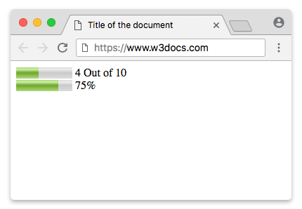
Ejemplo de la etiqueta HTML <meter>:
Ejemplo de la etiqueta HTML <meter>|W3Docs
<!DOCTYPE html>
<html>
  <head>
    <title>Title of the document</title>
  </head>
  <body>
    <meter value="4" min="0" max="10">4 out of 10</meter> 4 Out of 10<br />
    <meter value="0.75">75%</meter> 75%
  </body>
</html>Resultado
DANGER
La etiqueta <meter> no se usa para indicar progreso. Para ese propósito, usa la etiqueta <progress>.
TIP
Usa las propiedades CSS background-color, box-shadow, width y height para dar estilo al elemento <meter>.
Ejemplo de la etiqueta HTML <progress> usada con las propiedades CSS background-color, box-shadow, width y height:
Descarga y barras de progreso usando la etiqueta HTML <progress>|Ejemplo|W3Docs
<!DOCTYPE html>
<html>
  <head>
    <title>Title of the document</title>
    <style>
      progress[value] {
        -webkit-appearance: none;
        appearance: none;
        width: 220px;
        height: 20px;
      }
      progress[value]::-webkit-progress-bar {
        background-color: #eee;
        box-shadow: 0 0 3px #666 inset;
      }
      progress[value]::-webkit-progress-value {
        background: -webkit-linear-gradient(-45deg, transparent 30%, #8ebf42 70%, #8ebf42 40%, transparent 30%),
        -webkit-linear-gradient(top, #96f204, #8ebf42),
        -webkit-linear-gradient(right, #96f204, #8ebf42);
        background-size: 40px 20px, 100% 100%, 100% 100%;
      }
    </style>
  </head>
  <body>
    <p>Downloading:
      <progress value="35" max="100"></progress>
      <span>35%</span>
    </p>
    <p>Progress bar:
      <progress value="80" max="100"></progress>
      <span>80%</span>
    </p>
  </body>
</html>Mostrando un rango numérico
Los atributos min y max definen el rango para el meter. Usa el atributo optimum para definir el número deseado, por ejemplo, la nota de aprobado en un examen. Ten en cuenta que el estilo visual basado en el atributo optimum puede variar entre navegadores.
Etiqueta HTML <meter>
<meter value="15" min="0" max="70" optimum="60"></meter>Mostrando un porcentaje
Mostrando un porcentaje
<meter value="0.8">80%</meter>Estilizando la etiqueta HTML <meter>
Ante todo, establece el tamaño con las propiedades width y height.
Ejemplo de la etiqueta HTML <meter>:
meter {
  width: 300px;
  height: 20px;
}
Los navegadores modernos no ofrecen ganchos de estilo fiables y compatibles entre navegadores para el control nativo meter. Los pseudo-elementos específicos de cada proveedor que se muestran a continuación están obsoletos o no son compatibles en los navegadores actuales, por lo que no se debe depender de ellos para el estilo en producción. Si necesitas un indicador totalmente estilizado y accesible, considera usar un componente personalizado compatible con ARIA o la etiqueta <progress> cuando el valor represente progreso.
Aquí necesitas usar fallbacks porque los navegadores de grado A proporcionan pseudo-clases separadas para dar estilo al elemento <meter>. Usaremos el fallback de Webkit/Blink. Proporciona las siguientes pseudo-clases:
| Pseudo-class | Description |
|---|---|
| -webkit-meter-inner-element | Additional markup that is used for rendering the meter element as read-only. |
| -webkit-meter-bar | It contains meter gauge holding the value. |
| -webkit-meter-optimum-value | The current value of the meter element which is by default green when the value attribute falls within the low-high range. |
| -webkit-meter-suboptimum-value | The meter tag becomes yellow when the value is outside the low-high range. |
| -webkit-meter-even-less-good-value | The meter tag becomes red when the value and the optimum attributes are outside the low-high range but in opposite zones. For example, value high > low > optimum. |
Luego, necesitaremos establecer la appearance predeterminada del indicador del meter en "none".
Etiqueta meter estilizada con la propiedad appearance
meter {
  -webkit-appearance: none;
}
En nuestro ejemplo, usaremos las pseudo-clases -webkit-meter-bar y -webkit-meter-optimum-value.
Estilizando la etiqueta HTML <meter>
meter::-webkit-meter-bar {
  background: none;
  background-color: lightgrey;
  box-shadow: 0 3px 3px -3px #333 inset;
}

meter::-webkit-meter-optimum-value {
  box-shadow: 0 3px 3px -3px #999 inset;
  background-image: linear-gradient( 90deg, #2286c9 5%, #FF00FF 5%, #FF00FF 15%, #04C319 15%, #04C319 55%, #F1F70D 55%, #F1F70D 95%, #00FFCC 95%, #00FFCC 100%);
  background-size: 100% 100%;
}
Cada color en el degradado lineal de fondo representa el espacio que consumen las subcategorías.
Estilizando la etiqueta HTML <meter>
meter::-webkit-meter-optimum-value {
  -webkit-transition: width .5s;
}

meter::-webkit-meter-optimum-value:hover {
  background-image: linear-gradient( 90deg, #8bcf69 20%, #e6d450 20%, #e6d450 40%, #f28f68 40%, #f28f68 60%, #cf82bf 60%, #cf82bf 80%, #719fd1 80%, #719fd1 100%);
  transition: width .5s;
  width: 100%;
}
Ejemplo de estilizar la etiqueta HTML <meter>:
Ejemplo de estilizar la etiqueta HTML <meter>:
<!DOCTYPE html>
<html>
  <head>
    <title>Title of the document</title>
    <style>
      meter {
        width: 300px;
        height: 20px;
      }
      meter::-webkit-meter-bar {
        background: none;
        background-color: lightgrey;
        box-shadow: 0 3px 3px -3px #333 inset;
      }
      meter::-webkit-meter-optimum-value {
        box-shadow: 0 3px 3px -3px #999 inset;
        background-image: linear-gradient( 90deg, #2286c9 5%, #FF00FF 5%, #FF00FF 15%, #04C319 15%, #04C319 55%, #F1F70D 55%, #F1F70D 95%, #00FFCC 95%, #00FFCC 100%);
        background-size: 100% 100%;
      }
    </style>
  </head>
  <body>
    <meter value="30" min="0" max="70"></meter>
  </body>
</html>Tanto las propiedades transition como animation en el elemento <meter> son compatibles con los navegadores Webkit. Cambia el ancho del valor (en :hover) usando transiciones y anima la background-position del contenedor con keyframes.
Ejemplo de estilizar la etiqueta HTML <meter> con la propiedad CSS transition:
Ejemplo de estilizar la etiqueta HTML <meter> con la propiedad CSS transition
<!DOCTYPE html>
<html>
  <head>
    <title>Title of the document</title>
    <style>
      meter {
        width: 300px;
        height: 20px;
      }
      meter::-webkit-meter-bar {
        background: none;
        background-color: lightgrey;
        box-shadow: 0 3px 3px -3px #333 inset;
      }
      meter::-webkit-meter-optimum-value {
        -webkit-transition: width .5s;
        box-shadow: 0 5px 5px -5px #999 inset;
        background-image: linear-gradient( 90deg, #2286c9 5%, #FF00FF 5%, #FF00FF 15%, #04C319 15%, #04C319 55%, #F1F70D 55%, #F1F70D 95%, #00FFCC 95%, #00FFCC 100%);
        background-size: 100% 100%;
      }
      meter::-webkit-meter-optimum-value:hover {
        /* Reset each sub-category to 20% */
        background-image: linear-gradient( 90deg, #2286c9 20%, #FF00FF 20%, #FF00FF 40%, #04C319 40%, #04C319 60%, #F1F70D 60%, #F1F70D 80%, #00FFCC 80%, #00FFCC 100%);
        transition: width .5s;
        width: 100% !important;
      }
    </style>
  </head>
  <body>
    <meter value="25" min="0" max="70"></meter>
  </body>
</html>Los pseudo-elementos en el indicador del meter solo son compatibles con los navegadores Webkit. Los pseudo-elementos pueden usarse para mostrar la información meta encima del indicador del meter.
Estilizando la etiqueta HTML <meter>
meter {
  margin: 2em;
  position: relative;
}

meter::before {
  content: 'Used storage';
  position: absolute;
  top: -100%;
}

meter::after {
  content: 'Free storage';
  position: absolute;
  top: -100%;
  right: 0;
}
Ejemplo de la etiqueta HTML <meter> usada con pseudo-elementos:
Ejemplo de la etiqueta HTML <meter> usada con pseudo-elementos:
<!DOCTYPE html>
<html>
  <head>
    <title>Title of the document</title>
    <style>
      meter {
        margin: 2em;
        width: 400px;
        height: 30px;
        position: relative;
      }
      meter::before {
        content: 'Used storage';
        position: absolute;
        top: -100%;
      }
      meter::after {
        content: 'Free storage';
        position: absolute;
        top: -100%;
        right: 0;
      }
      meter::-webkit-meter-bar {
        background: none;
        background-color: lightgray;
        box-shadow: 0 5px 5px -5px #333 inset;
      }
      meter::-webkit-meter-optimum-value {
        -webkit-transition: width .5s;
        box-shadow: 0 5px 5px -5px #999 inset;
        background-image: linear-gradient( 90deg, #8bcf69 5%, #e6d450 5%, #e6d450 15%, #f28f68 15%, #f28f68 55%, #cf82bf 55%, #cf82bf 95%, #719fd1 95%, #719fd1 100%);
        background-size: 100% 100%;
      }
      meter::-webkit-meter-optimum-value:hover {
        /* Reset each sub-category to 20% */
        background-image: linear-gradient( 90deg, #8bcf69 20%, #e6d450 20%, #e6d450 40%, #f28f68 40%, #f28f68 60%, #cf82bf 60%, #cf82bf 80%, #719fd1 80%, #719fd1 100%);
        transition: width .5s;
        width: 100% !important;
        /* !important required. to override the inline styles in WebKit. */
      }
    </style>
  </head>
  <body>
    <meter value="25" min="0" max="70"></meter>
  </body>
</html>Ahora, usemos el fallback de Firefox. Pinta el indicador del meter usando -moz-appearance: meterbar. Si no necesitas el bisel y relieve predeterminados, establece -moz-appearance en "none".
Estilizando la etiqueta HTML <meter>
meter {
  -moz-appearance: none;
  width: 400px;
  height: 30px;
}
Firefox ya no admite dar estilo al indicador del meter mediante pseudo-elementos CSS.
Aquí daremos estilo al fondo del valor del indicador del meter usando la pseudo-clase ::-moz-meter-bar.
Estilizando la etiqueta HTML <meter>
meter::-moz-meter-bar {
  box-shadow: 0 5px 5px -5px #999 inset;
  background-image: linear-gradient( 90deg, #2286c9 5%, #FF00FF 5%, #FF00FF 15%, #04C319 15%, #04C319 55%, #F1F70D 55%, #F1F70D 95%, #00FFCC 95%, #00FFCC 100%);
  background-size: 100% 100%;
}
En Firefox, puedes usar el propio selector meter para dar estilo al fondo del contenedor.
Estilizando la etiqueta HTML <meter>
meter {
  background: none;
  background-color: lightgray;
  box-shadow: 0 5px 5px -5px #333 inset;
}
Ejemplo de la etiqueta HTML <meter> para Firefox:
Ejemplo de la etiqueta HTML <meter> para Firefox
<!DOCTYPE html>
<html>
  <head>
    <title>Title of the document</title>
    <style>
      meter {
        width: 400px;
        height: 30px;
        background: none;
        /* Required to get rid of the default background property */
        background-color: lightgray;
        box-shadow: 0 5px 5px -5px #333 inset;
      }
      meter::-moz-meter-bar {
        box-shadow: 0 5px 5px -5px #999 inset;
        background-image: linear-gradient( 90deg, #2286c9 5%, #FF00FF 5%, #FF00FF 15%, #04C319 15%, #04C319 55%, #F1F70D 55%, #F1F70D 95%, #00FFCC 95%, #00FFCC 100%);
        background-size: 100% 100%;
      }
    </style>
  </head>
  <body>
    <meter value="30" min="0" max="70"></meter>
  </body>
</html>Los pseudo elementos ::before y ::after en el indicador del meter no son compatibles con Firefox. La compatibilidad con las transiciones y animaciones CSS3 también es débil.
Atributos
| Attribute | Value | Description |
|---|---|---|
| form | form_id | Indicates form (forms), which the <meter> tag belongs to. |
| high | number | Indicates high values (but not maximum ones). If the high value is less than the low, then the high = low. If high is set larger than max, then high = max. |
| low | number | Defines low values (but not minimal ones). This value must be less than high. If the low value is less than the min, then low = min. |
| max | number | Defines the maximum possible value. The default value is 1. |
| min | number | Defines the minimum possible value. The default value is 0. |
| optimum | number | Defines the optimal number, which must be within the range defined by the min and max attributes. It may be larger than the high value. |
| value | number | Sets the current value. If omitted, the default value is 0.5. |
La etiqueta <meter> admite los atributos globales y los atributos de evento.
Practice
¿Cuál es la función de la etiqueta HTML <meter>?