Propiedad CSS column-rule-width
La propiedad CSS column-rule-width establece el grosor de la línea divisoria entre columnas en un diseño multicolumna, con ejemplos.
La propiedad CSS column-rule-width establece el grosor de la regla (la línea divisoria) que se dibuja entre las columnas de un diseño multicolumna. Funciona igual que el ancho de un borde, pero en lugar de rodear una caja, la regla se sitúa en el espacio entre columnas. Es una de las propiedades CSS3.
Por sí sola, column-rule-width no produce ningún efecto visible. La regla solo aparece cuando column-rule-style tiene un valor distinto de none (el valor inicial), ya que una línea sin estilo no tiene nada que dibujar. También se necesita más de una columna: la regla solo se pinta en los espacios que realmente separan columnas, y nunca en el espacio vacío que queda cuando el contenido no llena todas las columnas.
Esta propiedad acepta uno de los siguientes valores:
thin— una regla delgada.medium— una regla mediana. Este es el valor inicial.thick— una regla gruesa.<length>— un ancho explícito como2pxo0.2em. Los porcentajes y los valores negativos no están permitidos.
La especificación deja deliberadamente que el navegador decida el grosor exacto en píxeles de thin, medium y thick. Solo garantiza el orden: thin ≤ medium ≤ thick. Cuando necesites un resultado predecible entre navegadores, utiliza un valor <length>.
En la mayoría de las hojas de estilo se establece el ancho, el estilo y el color de forma conjunta con la abreviatura column-rule, en lugar de escribir tres declaraciones separadas:
/* These two rules are equivalent */
column-rule: 15px groove #1c87c9;

column-rule-width: 15px;
column-rule-style: groove;
column-rule-color: #1c87c9;| Valor inicial | medium |
|---|---|
| Se aplica a | Elementos multicolumna. |
| Heredable | No. |
| Animable | Sí. El ancho y el color de la regla son animables. |
| Versión | CSS3 |
| Sintaxis DOM | object.style.columnRuleWidth = "5px"; |
Sintaxis
Sintaxis de la propiedad CSS column-rule-width
column-rule-width: medium | thin | thick | length | initial | inherit;Ejemplo de la propiedad column-rule-width:
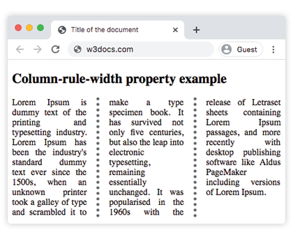
Ejemplo de la propiedad CSS column-rule-width con el valor thick
<!DOCTYPE html>
<html>
  <head>
    <title>Title of the document</title>
    <style>
      div {
        column-count: 3;
        column-gap: 40px;
        column-rule-style: dotted;
        column-rule-color: #666;
        column-rule-width: thick;
        text-align: justify;
      }
    </style>
  </head>
  <body>
    <h1>Column-rule-width property example</h1>
    <div>
      Lorem Ipsum is dummy text of the printing and typesetting industry. Lorem Ipsum has been the industry's standard dummy text ever since the 1500s, when an unknown printer took a galley of type and scrambled it to make a type specimen book. It has survived not only five centuries, but also the leap into electronic typesetting, remaining essentially unchanged. It was popularised in the 1960s with the release of Letraset sheets containing Lorem Ipsum passages, and more recently with desktop publishing software like Aldus PageMaker including versions of Lorem Ipsum.
    </div>
  </body>
</html>Resultado
Ejemplo de la propiedad column-rule-width con el valor "thin":
Ejemplo de la propiedad CSS column-rule-width con el valor thin
<!DOCTYPE html>
<html>
  <head>
    <title>Title of the document</title>
    <style>
      div {
        column-count: 3;
        column-gap: 40px;
        column-rule-style: solid;
        column-rule-width: thin;
        text-align: justify;
      }
    </style>
  </head>
  <body>
    <h1>Column-rule-width property example</h1>
    <div>
      Lorem Ipsum is dummy text of the printing and typesetting industry. Lorem Ipsum has been the industry's standard dummy text ever since the 1500s, when an unknown printer took a galley of type and scrambled it to make a type specimen book. It has survived not only five centuries, but also the leap into electronic typesetting, remaining essentially unchanged. It was popularised in the 1960s with the release of Letraset sheets containing Lorem Ipsum passages, and more recently with desktop publishing software like Aldus PageMaker including versions of Lorem Ipsum.
    </div>
  </body>
</html>Ejemplo de la propiedad column-rule-width especificada como "15px":
Ejemplo de la propiedad CSS column-rule-width con el valor length
<!DOCTYPE html>
<html>
  <head>
    <title>Title of the document</title>
    <style>
      div {
        column-count: 3;
        column-gap: 40px;
        column-rule-style: groove;
        column-rule-color: #1c87c9;
        column-rule-width: 15px;
        text-align: justify;
      }
    </style>
  </head>
  <body>
    <h1>Column-rule-width property example</h1>
    <div>
      Lorem Ipsum is dummy text of the printing and typesetting industry. Lorem Ipsum has been the industry's standard dummy text ever since the 1500s when an unknown printer took a galley of type and scrambled it to make a type specimen book. It has survived not only five centuries, but also the leap into electronic typesetting, remaining essentially unchanged. It was popularised in the 1960s with the release of Letraset sheets containing Lorem Ipsum passages, and more recently with desktop publishing software like Aldus PageMaker including versions of Lorem Ipsum.
    </div>
  </body>
</html>Valores
| Valor | Descripción | Pruébalo |
|---|---|---|
| medium | La regla es mediana. Este es el valor por defecto. | |
| thick | La regla es gruesa. | |
| thin | La regla es delgada. | |
| length | Especifica el ancho de la regla. | |
| initial | Establece la propiedad a su valor por defecto. | |
| inherit | Hereda la propiedad de su elemento padre. |
Consideraciones importantes
- La regla no ocupa espacio en el diseño. Al igual que
box-shadow, la regla se pinta dentro delcolumn-gap. Una regla más ancha que el espacio solapará el contenido de las columnas en lugar de separarlas, así que asegúrate de que el espacio sea suficientemente ancho para el valor elegido. - Sin estilo no hay regla. Si
column-rule-styleesnone(o no está definido), cambiar el ancho no tiene ningún efecto visible. Esta es la razón más común por la que una regla "no aparece". - Solo longitudes — sin porcentajes. A diferencia de muchos tamaños CSS,
column-rule-widthrechaza porcentajes y valores negativos; un valor inválido hace que toda la declaración sea ignorada. - Es animable. Hacer una transición del ancho produce un engrosamiento o adelgazamiento suave del divisor.
Propiedades relacionadas
La regla multicolumna está controlada por una pequeña familia de propiedades que normalmente se usan juntas:
column-rule— la abreviatura para ancho, estilo y color.column-rule-style— el estilo de línea; necesario para que el ancho se muestre.column-rule-color— el color de la regla.column-countycolumn-gap— definen cuántas columnas hay y el espacio donde vive la regla.