Propiedad CSS overflow
La propiedad CSS overflow define cómo debe comportarse el contenido dentro del contenedor. Consulta los valores y ejemplos.
La propiedad CSS overflow controla lo que ocurre cuando el contenido de un elemento es demasiado grande para caber dentro de su caja. Tú decides si el contenido extra simplemente se recorta, se muestra de todas formas o se hace desplazable.
El desbordamiento solo se hace visible cuando la caja tiene un tamaño restringido. La forma más habitual de restringirla es establecer una height fija (y opcionalmente un width), aunque una caja también puede estar restringida por un diseño flex o grid. Si la caja puede crecer libremente para ajustarse a su contenido, no hay nada que desborde y la propiedad no tiene efecto visible.
overflow es una propiedad abreviada que establece dos propiedades individuales a la vez:
- overflow-x — controla el recorte en el eje horizontal (izquierda/derecha).
- overflow-y — controla el recorte en el eje vertical (arriba/abajo).
Cuando se le da a overflow un solo valor, ambos ejes lo reciben. Con dos valores, el primero se aplica a overflow-x y el segundo a overflow-y (por ejemplo, overflow: hidden scroll;).
Valores de un vistazo
La propiedad overflow acepta estas palabras clave:
visible— el valor predeterminado. El contenido no se recorta; se desborda fuera de la caja y se superpone a lo que esté junto a ella.hidden— el contenido que no cabe se recorta y se vuelve invisible. No se ofrece ninguna barra de desplazamiento, por lo que la parte oculta es inaccesible para el usuario.scroll— el contenido se recorta y las barras de desplazamiento se muestran siempre (incluso cuando todo cabe), lo que evita que el diseño se desplace.auto— el contenido se recorta y las barras de desplazamiento aparecen solo cuando es necesario. Esta es la opción habitual para paneles desplazables.overlay— comoauto, pero las barras de desplazamiento se dibujan sobre el contenido en lugar de ocupar espacio.
El valor overlay está obsoleto y no debe usarse. Usa auto en su lugar: los navegadores modernos pueden dibujar barras de desplazamiento superpuestas según la configuración del sistema operativo del usuario.
Elegir un valor
- Usa
autopara una región desplazable (paneles de chat, bloques de código, modales): las barras de desplazamiento aparecen solo si el contenido realmente se desborda. - Usa
hiddenpara recortar contenido de forma deliberada, para recortar una imagen con esquinas redondeadas o para contener flotantes (ver más abajo). Recuerda que el contenido recortado desaparece para el usuario, así que no ocultes nada que necesite alcanzar. - Usa
scrollcuando quieras un espacio reservado para la barra de desplazamiento para que el diseño no salte al cambiar el contenido. - Déjalo como
visiblecuando el desbordamiento sea aceptable, como un tooltip o un menú desplegable que intencionalmente se extiende más allá de su elemento padre.
Dos efectos secundarios útiles
Contener flotantes. Establecer overflow en cualquier valor distinto de visible hace que el elemento crezca lo suficiente para envolver sus hijos flotantes. Así, un padre con overflow: hidden (o auto) y sin altura declarada se extenderá para incluir el contenido flotante dentro de él. Ten en cuenta que esto no elimina el float, solo lo contiene. (La alternativa moderna es display: flow-root, que hace lo mismo sin los efectos secundarios del recorte.)
Crear un contexto de formato de bloque (BFC). Un valor overflow distinto de visible inicia un nuevo contexto de formato de bloque. Esto es útil cuando quieres que un elemento de bloque se sitúe ordenadamente junto a un elemento flotante en lugar de fluir por debajo de él.
| Valor inicial | visible |
|---|---|
| Se aplica a | Contenedores de bloque, contenedores flex y contenedores grid. |
| Heredado | No. |
| Animable | No. |
| Versión | CSS2 |
| Sintaxis DOM | Object.style.overflow = "auto"; |
Sintaxis
Sintaxis CSS de overflow
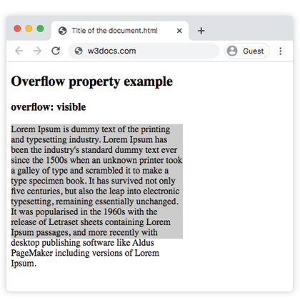
overflow: visible | hidden | scroll | auto | overlay | initial | inherit;Ejemplo de la propiedad overflow con el valor "visible"
Con visible, el texto del párrafo se extiende más allá del límite inferior de su caja de 200px en lugar de ser cortado: el comportamiento predeterminado.
Ejemplo de código CSS overflow
<!DOCTYPE html>
<html>
  <head>
    <style>
      p {
        background-color: #ccc;
        width: 300px;
        height: 200px;
        overflow: visible;
      }
    </style>
  </head>
  <body>
    <h2>Overflow property example</h2>
    <h3>overflow: visible</h3>
    <p>Lorem Ipsum is dummy text of the printing and typesetting industry. Lorem Ipsum has been the industry's standard dummy text ever since the 1500s when an unknown printer took a galley of type and scrambled it to make a type specimen book. It has survived not only five centuries, but also the leap into electronic typesetting, remaining essentially unchanged. It was popularised in the 1960s with the release of Letraset sheets containing Lorem Ipsum passages, and more recently with desktop publishing software like Aldus PageMaker including versions of Lorem Ipsum.</p>
  </body>
</html>Resultado
Ejemplo de la propiedad overflow con el valor "scroll"
Con scroll, ambas barras de desplazamiento aparecen tanto si son necesarias como si no, y el texto desbordante se vuelve accesible al desplazarse.
Ejemplo CSS overflow scroll
<!DOCTYPE html>
<html>
  <head>
    <style>
      p {
        background-color: #ccc;
        width: 300px;
        height: 200px;
        overflow: scroll;
      }
    </style>
  </head>
  <body>
    <h2>Overflow property example</h2>
    <h3>overflow: scroll</h3>
    <p>Lorem Ipsum is simply dummy text of the printing and typesetting industry. Lorem Ipsum has been the industry's standard dummy text ever since the 1500s when an unknown printer took a galley of type and scrambled it to make a type specimen book. It has survived not only five centuries, but also the leap into electronic typesetting, remaining essentially unchanged. It was popularised in the 1960s with the release of Letraset sheets containing Lorem Ipsum passages, and more recently with desktop publishing software like Aldus PageMaker including versions of Lorem Ipsum.</p>
  </body>
</html>Ejemplo de la propiedad overflow con el valor "hidden"
Con hidden, el texto que no cabe se recorta y no hay barra de desplazamiento, por lo que la parte cortada no es accesible.
Ejemplo CSS overflow hidden
<!DOCTYPE html>
<html>
  <head>
    <style>
      p {
        background-color: #ccc;
        width: 300px;
        height: 200px;
        overflow: hidden;
      }
    </style>
  </head>
  <body>
    <h2>Overflow property example</h2>
    <h3>overflow: hidden</h3>
    <p>Lorem Ipsum is dummy text of the printing and typesetting industry. Lorem Ipsum has been the industry's standard dummy text ever since the 1500s when an unknown printer took a galley of type and scrambled it to make a type specimen book. It has survived not only five centuries, but also the leap into electronic typesetting, remaining essentially unchanged. It was popularised in the 1960s with the release of Letraset sheets containing Lorem Ipsum passages, and more recently with desktop publishing software like Aldus PageMaker including versions of Lorem Ipsum.</p>
  </body>
</html>Ejemplo de la propiedad overflow con el valor "auto"
auto es el valor más práctico: una barra de desplazamiento aparece solo en el eje que realmente se desborda. Este ejemplo también muestra cómo overflow-x y overflow-y pueden establecerse de forma independiente.
CSS overflow auto
<!DOCTYPE html>
<html>
  <head>
    <title>Title of the document</title>
    <style>
      .scroll {
        width: 200px;
        height: 300px;
        border: 1px solid;
        overflow: auto;
        margin-bottom: 10px;
      }
      .scroll-x {
        width: 200px;
        height: 300px;
        border: 1px solid;
        overflow-x: auto;
        overflow-y: hidden;
        margin-bottom: 10px;
      }
      .scroll-y {
        width: 200px;
        height: 300px;
        border: 1px solid;
        overflow-y: auto;
        margin-bottom: 10px;
      }
      .scroll>div {
        width: 400px;
        height: 50px;
        background: #ccc;
      }
      .scroll-y>div {
        width: 200px;
        height: 50px;
        background: #ccc;
      }
      .scroll-x>div {
        width: 400px;
        height: 50px;
        background: #ccc;
        overflow: hidden;
      }
    </style>
  </head>
  <body>
    <h1>Example with Overflow Property</h1>
    <h2>overflow overflow scroll auto</h2>
    <div class="scroll">
      <h2>Overflow Property </h2>
      <div>
        <h2>overflow scroll property</h2>
      </div>
      <p>
        Lorem Ipsum is dummy text of the printing and typesetting industry. Lorem Ipsum has been the industry's standard dummy text ever since the 1500s when an unknown printer took a galley of type and scrambled it to make a type specimen book. It has survived not only five centuries, but also the leap into electronic typesetting, remaining essentially unchanged. It was popularised in the 1960s with the release of Letraset sheets containing Lorem Ipsum passages, and more recently with desktop publishing software like Aldus PageMaker including versions of Lorem Ipsum.
      </p>
    </div>
    <h2>overflow overflow-x auto</h2>
    <div class="scroll-x">
      <h2>Overflow Property </h2>
      <div>
        <h2>overflow scroll-x property</h2>
      </div>
      <p>
        Lorem Ipsum is dummy text of the printing and typesetting industry. Lorem Ipsum has been the industry's standard dummy text ever since the 1500s when an unknown printer.
      </p>
    </div>
    <h2>overflow overflow-y auto</h2>
    <div class="scroll-y">
      <h2>Overflow Property </h2>
      <div>
        <h2>overflow scroll-y property</h2>
      </div>
      <p>
        Lorem Ipsum is dummy text of the printing and typesetting industry. Lorem Ipsum has been the industry's standard dummy text ever since the 1500s when an unknown printer took a galley of type and scrambled it to make a type specimen book. software like Aldus PageMaker including versions of Lorem Ipsum.but also the leap into electronic typesetting, remaining essentially unchanged. It was popularised in the 1960s with the release of Letraset sheets containing Lorem Ipsum passages, and more recently with desktop publishing software like Aldus PageMaker including versions of Lorem Ipsum.
      </p>
    </div>
  </body>
</html>Ejemplo de la propiedad overflow con todos los valores
Este ejemplo coloca el mismo texto en cinco cajas para que puedas comparar cada valor uno al lado del otro.
Ejemplo CSS overflow con todos los valores
<!DOCTYPE html>
<html>
  <head>
    <title>Title of the document</title>
    <style>
      div.scroll {
        background-color: #eee;
        width: 300px;
        height: 200px;
        overflow: scroll;
      }
      div.hidden {
        background-color: #eee;
        width: 300px;
        height: 200px;
        overflow: hidden;
      }
      div.auto {
        background-color: #eee;
        width: 300px;
        height: 200px;
        overflow: auto;
      }
      div.visible {
        background-color: #eee;
        width: 300px;
        height: 200px;
        overflow: visible;
      }
      div.overlay {
        background-color: #eee;
        width: 300px;
        height: 200px;
        overflow: overlay;
      }
    </style>
  </head>
  <body>
    <h2>Overflow property example</h2>
    <h3>overflow: scroll</h3>
    <div class="scroll">
      Lorem Ipsum is dummy text of the printing and typesetting industry. Lorem Ipsum has been the industry's standard dummy text ever since the 1 500s when an unknown printer took a galley of type and scrambled it to make a type specimen book. It has survived not only five centuries, but also the leap into electronic typesetting, remaining essentially unchanged. It was popularised in the 1960s with the release of Letraset sheets containing Lorem Ipsum passages, and more recently with desktop publishing software like Aldus PageMaker including versions of Lorem Ipsum.
    </div>
    <h3>overflow: hidden</h3>
    <div class="hidden">
      Lorem Ipsum is the dummying text of the printing and typesetting industry. Lorem Ipsum has been the industry's standard dummy text ever since the 1500s when an unknown printer took a galley of type and scrambled it to make a type specimen book. It has survived not only five centuries, but also the leap into electronic typesetting, remaining essentially unchanged. It was popularised in the 1960s with the release of Letraset sheets containing Lorem Ipsum passages, and more recently with desktop publishing software like Aldus PageMaker including versions of Lorem Ipsum.
    </div>
    <h3>overflow: auto</h3>
    <div class="auto">
      Lorem Ipsum is the dummying text of the printing and typesetting industry. Lorem Ipsum has been the industry's standard dummy text ever since the 1500s when an unknown printer took a galley of type and scrambled it to make a type specimen book. It has survived not only five centuries, but also the leap into electronic typesetting, remaining essentially unchanged. It was popularised in the 1960s with the release of Letraset sheets containing Lorem Ipsum passages, and more recently with desktop publishing software like Aldus PageMaker including versions of Lorem Ipsum.
    </div>
    <h3>overflow: visible</h3>
    <div class="visible">
      Lorem Ipsum is the dummying text of the printing and typesetting industry. Lorem Ipsum has been the industry's standard dummy text ever since the 1500s when an unknown printer took a galley of type and scrambled it to make a type specimen book. It has survived not only five centuries, but also the leap into electronic typesetting, remaining essentially unchanged. It was popularised in the 1960s with the release of Letraset sheets containing Lorem Ipsum passages, and more recently with desktop publishing software like Aldus PageMaker including versions of Lorem Ipsum.
    </div>
    <br />
    <br />
    <h3>overflow: overlay</h3>
    <div class="overlay">
      Lorem Ipsum is the dummying text of the printing and typesetting industry. Lorem Ipsum has been the industry's standard dummy text ever since the 1500s when an unknown printer took a galley of type and scrambled it to make a type specimen book. It has survived not only five centuries, but also the leap into electronic typesetting, remaining essentially unchanged. It was popularised in the 1960s with the release of Letraset sheets containing Lorem Ipsum passages, and more recently with desktop publishing software like Aldus PageMaker including versions of Lorem Ipsum.
    </div>
  </body>
</html>Valores
| Valor | Descripción | Pruébalo |
|---|---|---|
| visible | El contenido no se recorta y se renderiza fuera del cuadro de relleno. Este es el valor predeterminado de esta propiedad. | Pruébalo » |
| hidden | El contenido se recorta para ajustarse al cuadro de relleno. | Pruébalo » |
| scroll | Se agrega una barra de desplazamiento para ver el resto del contenido. | Pruébalo » |
| auto | Depende del navegador. Si el contenido se desborda, se agrega una barra de desplazamiento. | Pruébalo » |
| overlay | Funciona igual que auto, pero con las barras de desplazamiento dibujadas sobre el contenido en lugar de ocupar espacio. Este valor obsoleto no debe usarse más, aunque puede seguir funcionando. | Pruébalo » |
| initial | Hace que la propiedad use su valor predeterminado. | Pruébalo » |
| inherit | Hereda la propiedad de su elemento padre. |
Propiedades relacionadas
- overflow-x y overflow-y — establecen el recorte por eje.
- white-space — combina
nowrapconoverflow: hiddenpara mantener el texto en una línea antes de recortarlo. - display —
display: flow-rootcontiene flotantes sin los efectos secundarios de recorte deoverflow.