Propiedad CSS justify-content
Aprende sobre la propiedad justify-content, que define la posición de los elementos del contenedor. Consulta los valores con ejemplos.
La propiedad justify-content distribuye el espacio sobrante a lo largo del eje principal de un contenedor flex (o grid), controlando cómo se espacian y alinean sus elementos cuando no llenan toda la línea. Es una subpropiedad del módulo Flexible Box Layout y una de las propiedades CSS3.
Esta página explica qué es el eje principal, recorre cada valor con un ejemplo ejecutable y lista los aspectos importantes a tener en cuenta.
Por qué importa el eje principal
justify-content solo tiene efecto a lo largo del eje principal — la dirección en la que fluyen los elementos flex. Esa dirección la establece flex-direction:
flex-direction: row(el valor por defecto) → el eje principal va de izquierda a derecha, por lo quejustify-contentmueve los elementos horizontalmente.flex-direction: column→ el eje principal va de arriba a abajo, por lo que el mismo valor dejustify-contentahora mueve los elementos verticalmente.
Para alinear elementos en el eje transversal (la dirección perpendicular) usa align-items en su lugar, y para espaciar las líneas flex envueltas usa align-content. Un error común para principiantes es recurrir a justify-content para centrar algo verticalmente en un contenedor row predeterminado — eso es trabajo de align-items.
justify-content solo tiene efecto cuando el contenedor es un contenedor flex (o grid) — es decir, cuando la propiedad display está establecida en flex o grid. En un contenedor de bloque normal no hace nada.
| Valor inicial | flex-start |
|---|---|
| Se aplica a | Contenedores flex. |
| Heredable | No. |
| Animable | No. |
| Versión | CSS3 |
| Sintaxis DOM | object.style.justifyContent = "center"; |
Sintaxis
Sintaxis CSS de justify-content
justify-content: flex-start | flex-end | center | space-between | space-around | space-evenly | initial | inherit;Ejemplo de la propiedad justify-content:
Ejemplo de código CSS justify-content
<!DOCTYPE html>
<html>
<head>
<title>Title of the document </title>
<style>
.center {
width: 400px;
height: 150px;
border: 1px solid #666;
display: flex;
justify-content: center;
}
.center div {
width: 70px;
height: 70px;
background-color: #ccc;
border: 1px solid #666;
}
</style>
</head>
<body>
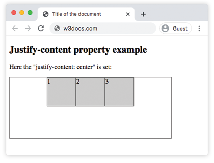
<h2>Justify-content property example</h2>
<p>Here the "justify-content: center" is set:</p>
<div class="center">
<div>1</div>
<div>2</div>
<div>3</div>
</div>
</body>
</html>Resultado
Ejemplo de la propiedad justify-content con el valor "flex-start":
Ejemplo CSS justify-content con flex-start
<!DOCTYPE html>
<html>
  <head>
    <title>Title of the document </title>
    <style>
      .start {
        width: 400px;
        height: 150px;
        border: 1px solid #666;
        display: flex;
        justify-content: flex-start;
      }
      .start div {
        width: 70px;
        height: 70px;
        background-color: #ccc;
        border: 1px solid #666;
      }
    </style>
  </head>
  <body>
    <h2>Justify-content property example</h2>
    <p>Here the "justify-content: flex-start" is set:</p>
    <div class="start">
      <div>1</div>
      <div>2</div>
      <div>3</div>
    </div>
  </body>
</html>Ejemplo de la propiedad justify-content con el valor "flex-end":
Ejemplo CSS justify-content con flex-end
<!DOCTYPE html>
<html>
  <head>
    <title>Title of the document </title>
    <style>
      .end {
        width: 400px;
        height: 150px;
        border: 1px solid #666;
        display: flex;
        justify-content: flex-end;
      }
      .end div {
        width: 70px;
        height: 70px;
        background-color: #ccc;
        border: 1px solid #666;
      }
    </style>
  </head>
  <body>
    <h2>Justify-content property example</h2>
    <p>Here the "justify-content: flex-end" is set:</p>
    <div class="end">
      <div>1</div>
      <div>2</div>
      <div>3</div>
    </div>
  </body>
</html>Ejemplo de la propiedad justify-content con el valor "space-between":
Ejemplo CSS justify-content con space-between
<!DOCTYPE html>
<html>
  <head>
    <title>Title of the document </title>
    <style>
      .space-between {
        width: 400px;
        height: 150px;
        border: 1px solid #666;
        display: flex;
        justify-content: space-between;
      }

      .space-between div {
        width: 70px;
        height: 70px;
        background-color: #ccc;
        border: 1px solid #666;
      }
    </style>
  </head>
  <body>
    <h2>Justify-content property example</h2>
    <p>Here the "justify-content: space-between" is set:</p>
    <div class="space-between">
      <div>1</div>
      <div>2</div>
      <div>3</div>
    </div>
  </body>
</html>Ejemplo de la propiedad justify-content con el valor "space-around":
Ejemplo CSS justify-content con space-around
<!DOCTYPE html>
<html>
  <head>
    <title>Title of the document </title>
    <style>
      .space-around {
        width: 400px;
        height: 150px;
        border: 1px solid #666;
        display: flex;
        justify-content: space-around;
      }
      .space-around div {
        width: 70px;
        height: 70px;
        background-color: #ccc;
        border: 1px solid #666;
      }
    </style>
  </head>
  <body>
    <h2>Justify-content property example</h2>
    <p>Here the "justify-content: space-around" is used:</p>
    <div class="space-around">
      <div>1</div>
      <div>2</div>
      <div>3</div>
    </div>
  </body>
</html>Ejemplo de la propiedad justify-content con el valor "space-evenly":
Con space-evenly los espacios antes del primer elemento, entre cada elemento y después del último son todos iguales. (Con space-around los espacios exteriores son solo la mitad del tamaño de los espacios entre elementos, mientras que space-between no tiene espacios exteriores en absoluto.)
<!DOCTYPE html>
<html>
  <head>
    <title>Title of the document </title>
    <style>
      .space-evenly {
        width: 400px;
        height: 150px;
        border: 1px solid #666;
        display: flex;
        justify-content: space-evenly;
      }
      .space-evenly div {
        width: 70px;
        height: 70px;
        background-color: #ccc;
        border: 1px solid #666;
      }
    </style>
  </head>
  <body>
    <h2>Justify-content property example</h2>
    <p>Here the "justify-content: space-evenly" is used:</p>
    <div class="space-evenly">
      <div>1</div>
      <div>2</div>
      <div>3</div>
    </div>
  </body>
</html>Aspectos a tener en cuenta
justify-contentno hace nada a menos que el padre sea un contenedor flex o grid (display: flex/display: grid).- Las tres palabras clave de "espacio" solo difieren en los espacios exteriores:
space-betweenno tiene ninguno,space-aroundda espacios exteriores a la mitad del tamaño,space-evenlyhace que todos los espacios sean iguales. - El eje sobre el que actúa sigue flex-direction. Cambia a
columny el mismo valor funciona de arriba a abajo. - Solo importa cuando hay espacio libre sobrante. Si los elementos ya llenan (o desbordan) el eje principal, la alineación no tiene nada que distribuir.
Valores
| Valor | Descripción | Pruébalo |
|---|---|---|
| flex-start | Los elementos comienzan desde el inicio del contenedor. | Pruébalo » |
| flex-end | Los elementos se colocan al final del contenedor. | Pruébalo » |
| center | Los elementos se colocan en el centro del contenedor. | Pruébalo » |
| space-around | Hay espacio antes, entre y después de los elementos. | Pruébalo » |
| space-between | Hay espacio entre los elementos. | Pruébalo » |
| space-evenly | Hay espacio igual antes, entre y después de los elementos. | Pruébalo » |
| initial | Hace que la propiedad use su valor por defecto. | Pruébalo » |
| inherit | Hereda la propiedad de su elemento padre. |
Práctica
Propiedades relacionadas
- align-items — alinea los elementos a lo largo del eje transversal.
- align-content — espacía las líneas flex envueltas a lo largo del eje transversal.
- flex-direction — establece cuál es el eje principal.
- The Ultimate Guide to Flexbox — el modelo completo de Flexbox en un solo lugar.