Propiedad background-clip de CSS
La propiedad CSS background-clip define el área a la que se pintan el background-color y el background-image. Si el elemento no tiene background-color o background-image, esta propiedad no tiene efecto visual.
La propiedad background-clip es una de las propiedades CSS3.
Para recortar un fondo al texto, también está disponible una versión con prefijo de proveedor (-webkit-background-clip).
| Valor inicial | border-box |
|---|---|
| Se aplica a | Todos los elementos. También se aplica a ::first-letter y ::first-line. |
| Heredable | No. |
| Animable | No. |
| Versión | CSS3 |
| Sintaxis DOM | object.style.backgroundClip = "content-box"; |
Sintaxis
Sintaxis de la propiedad CSS background-clip
background-clip: border-box | padding-box | content-box | text | initial | inherit;Ejemplo de la propiedad background-clip:
Ejemplo de la propiedad CSS background-clip con el valor content-box
<!DOCTYPE html>
<html>
  <head>
    <title>The title of the document</title>
    <style>
      #example {
        border: 3px solid #666;
        padding: 15px;
        background: #ccc;
        background-clip: content-box;
      }
    </style>
  </head>
  <body>
    <h2>Background-clip property example</h2>
    <p>Here the "content-box" value is used.</p>
    <div id="example">
      <p>The background extends to the edge of the content box.</p>
    </div>
  </body>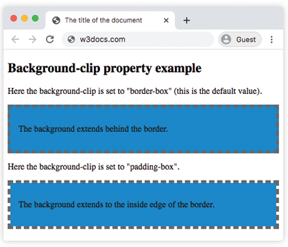
</html>En el siguiente ejemplo, observe la diferencia entre los valores "padding-box" y "border-box".
Ejemplo de la propiedad background-clip con los valores "padding-box" y "border-box":
Ejemplo de la propiedad CSS background-clip con el valor border-box
<!DOCTYPE html>
<html>
  <head>
    <title>The title of the document</title>
    <style>
      #example1 {
        border: 5px dashed #666;
        padding: 15px;
        background: #1c87c9;
        background-clip: border-box;
      }
      #example2 {
        border: 5px dashed #666;
        padding: 15px;
        background: #1c87c9;
        background-clip: padding-box;
      }
    </style>
  </head>
  <body>
    <h2>Background-clip property example</h2>
    <p>Here the background-clip is set to "border-box" (this is the default value).</p>
    <div id="example1">
      <p>The background extends behind the border.</p>
    </div>
    <p>Here the background-clip is set to "padding-box".</p>
    <div id="example2">
      <p>The background extends to the inside edge of the border.</p>
    </div>
  </body>
</html>En este ejemplo, el fondo se pinta dentro del texto en primer plano.
Ejemplo de la propiedad background-clip con el valor "text":
Ejemplo de la propiedad CSS background-clip con el valor text
<!DOCTYPE html>
<html>
  <head>
    <title>The title of the document</title>
    <style>
      #example {
        border: 3px dashed #1ebf42;
        padding: 15px;
        background: #1c87c9;
        background-clip: text;
        -webkit-background-clip: text;
        color: transparent;
      }
    </style>
  </head>
  <body>
    <h2>Background-clip property example</h2>
    <p>Here the background-clip is set to "text"</p>
    <div id="example">
      <p>The background is painted within the foreground text.</p>
    </div>
  </body>
</html>Valores
| Valor | Descripción | Probar |
|---|---|---|
| border-box | El fondo aparece detrás del borde. Este es el valor predeterminado. | Probar » |
| padding-box | El fondo aparece dentro del borde. | Probar » |
| content-box | El fondo se extiende hasta el borde del cuadro de contenido. | Probar » |
| text | El fondo se pinta dentro del texto en primer plano. | Probar » |
| initial | Establece la propiedad en su valor predeterminado. | Probar » |
| inherit | Hereda la propiedad de su elemento principal. |
Práctica
¿Cuál de los siguientes valores se puede usar con la propiedad 'background-clip' en CSS?