Propiedad stroke-linecap de CSS
La propiedad stroke-linecap especifica la forma de los remates en los extremos del trazo de un camino en SVG.
Cuando se usa como un atributo de presentación, puede ser sobrescrito por CSS. Cuando se usa en estilos en línea, tiene prioridad sobre el CSS externo.
INFO
La propiedad stroke-linecap puede usarse tanto como propiedad CSS como como atributo de presentación de SVG. Se puede aplicar a cualquier elemento, pero solo afecta a los siguientes: <altGlyph>, <path>, <polyline>, <line>, <text>, <textPath>, <tref> y <tspan>.
| Valor inicial | butt |
|---|---|
| Se aplica a | Elementos de formas y contenido de texto. |
| Heredable | Sí. |
| Animable | No. |
| Versión | Especificación SVG 1.1 |
| Sintaxis DOM | Object.strokeLinecap = "round"; |
Sintaxis
Sintaxis CSS de stroke-linecap
css
stroke-linecap: butt | square | round | initial | inherit;Ejemplo de la propiedad stroke-linecap:
Ejemplo de código CSS de stroke-linecap
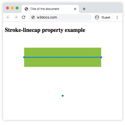
html
<!DOCTYPE html>
<html>
  <head>
    <title>Title of the document</title>
  </head>
  <body>
    <h2>Stroke-linecap property example</h2>
    <svg viewBox="0 0 6 4">
      <!-- Effect of the "butt" value -->
      <path d="M1,1 h4" stroke="#8ebf42"
        stroke-linecap="butt" />
      <!-- Effect of the "butt" value on a zero length path -->
      <path d="M3,3 h0" stroke="#8ebf42"
        stroke-linecap="butt" />
      <!--
        the following pink lines highlight the
        position of the path for each stroke
        -->
      <path d="M1,1 h4" stroke="#1c87c9" stroke-width="0.05" />
      <circle cx="1" cy="1" r="0.05" fill="#1c87c9" />
      <circle cx="5" cy="1" r="0.05" fill="#1c87c9" />
      <circle cx="3" cy="3" r="0.05" fill="#1c87c9" />
    </svg>
  </body>
</html>Resultado
Ejemplo de la propiedad stroke-linecap con el valor "round":
Ejemplo de stroke-linecap round en CSS
html
<!DOCTYPE html>
<html>
  <head>
    <title>Title of the document</title>
  </head>
  <body>
    <h2>Stroke-linecap property example</h2>
    <svg viewBox="0 0 6 4">
      <!-- Effect of the "round" value -->
      <path d="M1,1 h4" stroke="#8ebf42" stroke-linecap="round" />
      <!-- Effect of the "round" value on a zero length path -->
      <path d="M3,3 h0" stroke="#8ebf42" stroke-linecap="round" />
      <!--
      the following pink lines highlight the
      position of the path for each stroke
      -->
      <path d="M1,1 h4" stroke="#1c87c9" stroke-width="0.05" />
      <circle cx="1" cy="1" r="0.05" fill="#1c87c9" />
      <circle cx="5" cy="1" r="0.05" fill="#1c87c9" />
      <circle cx="3" cy="3" r="0.05" fill="#1c87c9" />
    </svg>
  </body>
</html>Ejemplo de la propiedad stroke-linecap con el valor "square":
Ejemplo de stroke-linecap square en CSS
html
<!DOCTYPE html>
<html>
  <head>
    <title>Title of the document</title>
  </head>
  <body>
    <h2>Stroke-linecap property example</h2>
    <svg viewBox="0 0 6 4">
      <!-- Effect of the "square" value -->
      <path d="M1,1 h4" stroke="#8ebf42" stroke-linecap="square" />
      <!-- Effect of the "square" value on a zero length path -->
      <path d="M3,3 h0" stroke="#8ebf42" stroke-linecap="square" />
      <!--
        the following pink lines highlight the
        position of the path for each stroke
        -->
      <path d="M1,1 h4" stroke="#1c87c9" stroke-width="0.05" />
      <circle cx="1" cy="1" r="0.05" fill="#1c87c9" />
      <circle cx="5" cy="1" r="0.05" fill="#1c87c9" />
      <circle cx="3" cy="3" r="0.05" fill="#1c87c9" />
    </svg>
  </body>
</html>Valores
| Valor | Descripción |
|---|---|
| butt | Termina el trazo con un ángulo agudo. En un subcamino de longitud cero, el camino no se renderizará. Este es el valor predeterminado. |
| square | Extiende el trazo más allá de la longitud del camino. |
| round | Hace que los puntos de inicio y fin sean redondeados. |
| initial | Palabra clave estándar de CSS que restablece la propiedad a su valor predeterminado. |
| inherit | Palabra clave estándar de CSS que hereda la propiedad de su elemento padre. |
Práctica
¿Qué afecta la propiedad 'stroke-linecap' en CSS?