Propiedad CSS filter
La propiedad filter se utiliza para aplicar efectos visuales a un elemento (image). La propiedad filter tiene los siguientes valores:
- none
- blur
- brightness
- contrast
- drop-shadow
- grayscale
- hue-rotate
- invert
- opacity
- saturate
- sepia
- url
| Initial Value | none |
|---|---|
| Applies to | All elements. |
| Inherited | No. |
| Animatable | Yes. |
| Version | CSS3 |
| DOM Syntax | object.style.filter = "hue-rotate(360deg)"; |
Sintaxis
Sintaxis de la propiedad CSS filter
filter: none | blur() | brightness() | contrast() | drop-shadow() | grayscale() | hue-rotate() | invert() | opacity() | saturate() | sepia() | url() | initial | inherit;Ejemplo de la propiedad filter:
Ejemplo de la propiedad CSS filter con el valor blur
<!DOCTYPE html>
<html>
<head>
<title>Title of the document</title>
<style>
img {
filter: blur(3px);
max-width: 100%;
}
</style>
</head>
<body>
<h2>Filter property example</h2>
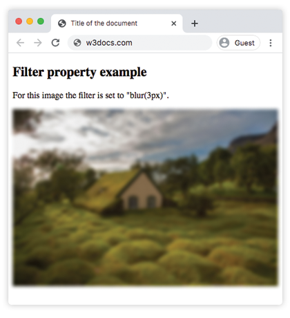
<p>For this image the filter is set to "blur(3px)".</p>
<p>
<img src="https://es.w3docs.com/uploads/media/default/0001/01/4982c4f43023330a662b9baed5a407e391ae6161.jpeg" alt="Background Image" />
</p>
</body>
</html>Resultado
Ejemplo de usar la propiedad filter para hacer la imagen más brillante:
Ejemplo de la propiedad CSS filter con el valor brightness
<!DOCTYPE html>
<html>
  <head>
    <title>Title of the document</title>
    <style>
      img {
        filter: brightness(150%);
        max-width: 100%;
      }
    </style>
  </head>
  <body>
    <h2>Filter property example</h2>
    <p>For this image the filter is set to "brightness(150%)".</p>
    <p>
      <img src="https://es.w3docs.com/uploads/media/default/0001/01/4982c4f43023330a662b9baed5a407e391ae6161.jpeg" alt="Background Image" />
    </p>
  </body>
</html>En los siguientes ejemplos, el valor "grayscale" hace que la imagen se vea en gris:
Ejemplo de la propiedad filter con el valor "grayscale":
Ejemplo de la propiedad CSS filter con el valor grayscale
<!DOCTYPE html>
<html>
  <head>
    <title>Title of the document</title>
    <style>
      img {
        filter: grayscale(80%);
        max-width: 100%;
      }
    </style>
  </head>
  <body>
    <h2>Filter example</h2>
    <p>For this image the filter is set to "grayscale(80%)".</p>
    <p>
      <img src="https://es.w3docs.com/uploads/media/default/0001/01/4982c4f43023330a662b9baed5a407e391ae6161.jpeg" alt="Background Image" />
    </p>
  </body>
</html>Aquí, el filtro "saturate" se aplica a la imagen con el valor dado de 300%.
Ejemplo de la propiedad filter con el valor "saturate":
Ejemplo de la propiedad CSS filter con el valor saturate
<!DOCTYPE html>
<html>
  <head>
    <title>Title of the document</title>
    <style>
      img {
        filter: saturate(300%);
        max-width: 100%;
      }
    </style>
  </head>
  <body>
    <h2>Filter example</h2>
    <p>For this image the filter is set to "saturate(300%)".</p>
    <p>
      <img src="https://es.w3docs.com/uploads/media/default/0001/01/4982c4f43023330a662b9baed5a407e391ae6161.jpeg" alt="Background Image" />
    </p>
  </body>
</html>Ejemplo de la propiedad filter con el valor "sepia":
Ejemplo de la propiedad filter con el valor sepia
<!DOCTYPE html>
<html>
  <head>
    <title>Title of the document</title>
    <style>
      img {
        filter: sepia(70%);
        max-width: 100%;
      }
    </style>
  </head>
  <body>
    <h2>Filter example</h2>
    <p>For this image the filter is set to "sepia(70%)".</p>
    <p>
      <img src="https://es.w3docs.com/uploads/media/default/0001/01/4982c4f43023330a662b9baed5a407e391ae6161.jpeg" alt="Background Image" />
    </p>
  </body>
</html>Ejemplo de la propiedad filter con el valor "contrast":
Ejemplo de la propiedad CSS filter con el valor contrast
<!DOCTYPE html>
<html>
  <head>
    <title>Title of the document</title>
    <style>
      img {
        filter: contrast(40%);
        max-width: 100%;
      }
    </style>
  </head>
  <body>
    <h2>Filter example</h2>
    <p>For this image the filter is set to "contrast(40%)".</p>
    <p>
      <img src="https://es.w3docs.com/uploads/media/default/0001/01/4982c4f43023330a662b9baed5a407e391ae6161.jpeg" alt="Background Image" />
    </p>
  </body>
</html>Ejemplo de la propiedad filter con el valor "opacity":
Ejemplo de la propiedad CSS filter con el valor "opacity"
<!DOCTYPE html>
<html>
  <head>
    <title>Title of the document</title>
    <style>
      img {
        filter: opacity(0.4);
        max-width: 100%;
      }
    </style>
  </head>
  <body>
    <h2>Filter example</h2>
    <p>For this image the filter is set to "opacity(0.4)".</p>
    <p>
      <img src="https://es.w3docs.com/uploads/media/default/0001/01/4982c4f43023330a662b9baed5a407e391ae6161.jpeg" alt="Background Image" />
    </p>
  </body>
</html>Ejemplo de la propiedad filter con el valor "invert":
Ejemplo de la propiedad CSS filter con el valor "invert"
<!DOCTYPE html>
<html>
  <head>
    <title>Title of the document</title>
    <style>
      img {
        filter: invert(0.7);
        max-width: 100%;
      }
    </style>
  </head>
  <body>
    <h2>Filter example</h2>
    <p>For this image the filter is set to "invert(0.7)".</p>
    <p>
      <img src="https://es.w3docs.com/uploads/media/default/0001/01/4982c4f43023330a662b9baed5a407e391ae6161.jpeg" alt="Background Image" />
    </p>
  </body>
</html>Ejemplo de la propiedad filter con el valor "hue-rotate":
Ejemplo de la propiedad CSS filter con el valor "hue-rotate"
<!DOCTYPE html>
<html>
  <head>
    <title>Title of the document</title>
    <style>
      img {
        filter: hue-rotate(90deg);
        max-width: 100%;
      }
    </style>
  </head>
  <body>
    <h2>Filter example</h2>
    <p>For this image the filter is set to "hue-rotate(90deg)".</p>
    <p>
      <img src="https://es.w3docs.com/uploads/media/default/0001/01/4982c4f43023330a662b9baed5a407e391ae6161.jpeg" alt="Background Image" />
    </p>
  </body>
</html>Valores
| Value | Description | Play it |
|---|---|---|
| none | No aplica ningún efecto. Este es el valor predeterminado de esta propiedad. | Play it » |
| blur | Aplica desenfoque a una imagen. Se especifica mediante un valor de longitud. Cuanto mayor sea el valor, más desenfoque se aplicará. Si no se aplica ningún valor, se usa 0. | Play it » |
| brightness | Hace que la imagen sea más brillante. Si el valor es 0, la imagen será negra. 100% es el valor predeterminado y muestra la imagen original. Los valores superiores a 100% hacen que la imagen sea más brillante. | Play it » |
| contrast | Ajusta el contraste de una imagen. Si el valor es 0, la imagen será negra. 100% es el valor predeterminado y muestra la imagen original. Los valores superiores a 100% aplican más contraste a la imagen. | Play it » |
| drop-shadow | Aplica un efecto de sombra paralela a la imagen. | Play it » |
| grayscale | Cambia la imagen a escala de grises. 0% es el valor de la imagen original. 100% hace que la imagen sea gris. No se permiten valores negativos. | Play it » |
| hue-rotate | Aplica un efecto de rotación de tono a la imagen. Se especifica en grados. El valor máximo es 360 grados. | Play it » |
| invert | Invierte las muestras de la imagen. 0 es el valor predeterminado. 100% hace que la imagen quede completamente invertida. | Play it » |
| opacity | Establece el nivel de opacidad de la imagen. Describe la transparencia de la imagen. Si el valor es 0, la imagen es completamente transparente. 100% es el estado actual de la imagen. | Play it » |
| saturate | Aplica el efecto de saturación a la imagen. 0% hace que la imagen quede completamente desaturada. 100% es el valor predeterminado de la imagen. Los valores superiores a 100% hacen que la imagen quede sobresaturada. | Play it » |
| sepia | Convierte la imagen a sepia. El valor predeterminado es 0%; 100% hace que la imagen quede completamente en sepia. | Play it » |
| url | La función url() toma la ubicación de un archivo SVG que especifica un filtro y puede incluir un ancla a un elemento de filtro específico. | |
| initial | Hace que la propiedad use su valor predeterminado. | |
| inherit | Hereda la propiedad del elemento padre. |
Practice
What are the different types of effects that can be achieved using the CSS filter property?