Propiedad CSS column-rule-width
La propiedad CSS column-rule-width define el ancho de la regla entre columnas. La propiedad column-rule-width es una de las propiedades CSS3.
La propiedad column-rule-width solo surte efecto cuando column-rule-style no es none.
Esta propiedad tiene los siguientes valores:
- medium
- thick
- thin
- length
INFO
La especificación no define el grosor exacto de cada palabra clave. Sin embargo, siempre siguen este orden: thin ≤ medium ≤ thick.
| Valor inicial | medium |
|---|---|
| Se aplica a | Elementos Multicol. |
| Heredable | No. |
| Animable | Sí. El ancho y el color de la regla son animables. |
| Versión | CSS3 |
| Sintaxis DOM | object.style.columnRuleWidth = "5px"; |
Sintaxis
Sintaxis de la propiedad CSS column-rule-width
css
column-rule-width: medium | thin | thick | length | initial | inherit;Ejemplo de la propiedad column-rule-width:
Ejemplo de la propiedad CSS column-rule-width con el valor thick
html
<!DOCTYPE html>
<html>
<head>
<title>Title of the document</title>
<style>
div {
column-count: 3;
column-gap: 40px;
column-rule-style: dotted;
column-rule-color: #666;
column-rule-width: thick;
text-align: justify;
}
</style>
</head>
<body>
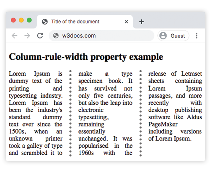
<h1>Column-rule-width property example</h1>
<div>
Lorem Ipsum is dummy text of the printing and typesetting industry. Lorem Ipsum has been the industry's standard dummy text ever since the 1500s, when an unknown printer took a galley of type and scrambled it to make a type specimen book. It has survived not only five centuries, but also the leap into electronic typesetting, remaining essentially unchanged. It was popularised in the 1960s with the release of Letraset sheets containing Lorem Ipsum passages, and more recently with desktop publishing software like Aldus PageMaker including versions of Lorem Ipsum.
</div>
</body>
</html>Resultado
Ejemplo de la propiedad column-rule-width con el valor "thin":
Ejemplo de la propiedad CSS column-rule-width con el valor thin
html
<!DOCTYPE html>
<html>
  <head>
    <title>Title of the document</title>
    <style>
      div {
        column-count: 3;
        column-gap: 40px;
        column-rule-style: solid;
        column-rule-width: thin;
        text-align: justify;
      }
    </style>
  </head>
  <body>
    <h1>Column-rule-width property example</h1>
    <div>
      Lorem Ipsum is dummy text of the printing and typesetting industry. Lorem Ipsum has been the industry's standard dummy text ever since the 1500s, when an unknown printer took a galley of type and scrambled it to make a type specimen book. It has survived not only five centuries, but also the leap into electronic typesetting, remaining essentially unchanged. It was popularised in the 1960s with the release of Letraset sheets containing Lorem Ipsum passages, and more recently with desktop publishing software like Aldus PageMaker including versions of Lorem Ipsum.
    </div>
  </body>
</html>Ejemplo de la propiedad column-rule-width especificada como "15px":
Ejemplo de la propiedad CSS column-rule-width con el valor length
html
<!DOCTYPE html>
<html>
  <head>
    <title>Title of the document</title>
    <style>
      div {
        column-count: 3;
        column-gap: 40px;
        column-rule-style: groove;
        column-rule-color: #1c87c9;
        column-rule-width: 15px;
        text-align: justify;
      }
    </style>
  </head>
  <body>
    <h1>Column-rule-width property example</h1>
    <div>
      Lorem Ipsum is dummy text of the printing and typesetting industry. Lorem Ipsum has been the industry's standard dummy text ever since the 1500s when an unknown printer took a galley of type and scrambled it to make a type specimen book. It has survived not only five centuries, but also the leap into electronic typesetting, remaining essentially unchanged. It was popularised in the 1960s with the release of Letraset sheets containing Lorem Ipsum passages, and more recently with desktop publishing software like Aldus PageMaker including versions of Lorem Ipsum.
    </div>
  </body>
</html>Valores
| Valor | Descripción | Probar » |
|---|---|---|
| medium | La regla es de grosor medio. Este es el valor predeterminado. | Probar » |
| thick | La regla es gruesa. | Probar » |
| thin | La regla es fina. | Probar » |
| length | Especifica el ancho de la regla. | Probar » |
| initial | Establece la propiedad en su valor predeterminado. | Probar » |
| inherit | Hereda la propiedad de su elemento padre. |
Práctica
¿Qué hace la propiedad 'column-rule-width' en CSS?