Propiedad CSS font-size
La propiedad font-size define el tamaño de fuente del texto.
El tamaño de fuente se puede definir de las siguientes maneras:
- absolute-size
- relative-size
- length
- percentage
El tamaño de fuente absoluto incluye los siguientes valores:
- xx-small
- x-small
- small
- medium
- large
- x-large
- xx-large
El tamaño de fuente relativo incluye los siguientes valores:
- smaller
- larger
Las longitudes pueden ser longitudes relativas (em, ex, px) y longitudes absolutas (in, cm, mm, pt, pc). Los porcentajes especifican un tamaño de fuente absoluto en relación con el tamaño de fuente del elemento padre.
| Initial Value | medium |
|---|---|
| Applies to | All elements. It also applies to ::first-letter and ::first-line. |
| Inherited | Yes. |
| Animatable | Yes. |
| Version | CSS1 |
| DOM Syntax | object.style.fontSize = "15px"; |
Sintaxis
Sintaxis de la propiedad CSS font-size
font-size: medium | xx-small | x-small | small | large | x-large | xx-large | smaller | larger | length | initial | inherit;Ejemplo de la propiedad font-size:
Ejemplo de la propiedad CSS font-size con valores px,em,pt,x-small y %(porcentaje)
<!DOCTYPE html>
<html>
<head>
<title>Title of the document</title>
<style>
h1 {
font-size: 24pt;
}
h3 {
font-size: 26px;
}
p {
font-size: 1em;
}
a {
font-size: 100%;
}
span {
font-size: x-small;
}
</style>
</head>
<body>
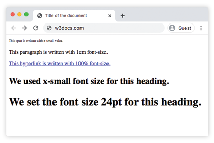
<span>This span is written with x-small value.</span>
<p>This paragraph is written with 1em font-size.</p>
<a href="https://www.w3docs.com/">This hyperlink is written with 100% font-size.</a>
<h3>We used x-small font size for this heading.</h3>
<h1>We set the font size 24pt for this heading.</h1>
</body>
</html>Resultado
Uso de valores porcentuales
Los valores porcentuales son relativos al font-size del elemento padre. El código siguiente muestra su uso:
Ejemplo de la propiedad font-size especificada en porcentaje:
Ejemplo de la propiedad font-size especificada en porcentaje:
<!DOCTYPE html>
<html>
  <head>
    <title>Title of the document</title>
    <style>
      h3 {
        font-size: 125%;
      }
    </style>
  </head>
  <body>
    <h3>We used x-small font size for this heading.</h3>
    <span>This span is written with x-small value.</span>
    <p>This paragraph is written with 1em font-size.</p>
  </body>
</html>
Uso de la unidad em
La unidad em se considera una unidad relativa. Se basa en el valor calculado del tamaño de fuente del elemento padre. En el siguiente código, el párrafo tendrá 32px, porque 2x16=32, y el encabezado tendrá un font-size de 48px porque 3x16=48px. Este método es muy útil porque podemos estar seguros de que todos los elementos hijos siempre serán relativos entre sí.
Ejemplo de la propiedad font-size con el valor "em":
Ejemplo de la propiedad font-size con el valor "em":
<!DOCTYPE html>
<html>
  <head>
    <title>Title of the document</title>
    <style>
      .container {
        font-size: 16px;
      }
      p {
        font-size: 2em;
      }
      h2 {
        font-size: 3em;
      }
    </style>
  </head>
  <body>
    <div class="container">
      <h2>Here is the heading</h2>
      <p>Here is the text.</p>
    </div>
  </body>
</html>Uso de la unidad rem
En el caso de usar la unidad rem, el font-size depende del valor del elemento HTML. En el ejemplo siguiente, la unidad rem se hereda del elemento HTML, por eso es igual a 24px. Así, el encabezado tendrá un font-size de 24px, porque 1.5x16=24px.
Ejemplo de la propiedad font-size con el valor "rem":
Ejemplo de la propiedad font-size con el valor "rem":
<!DOCTYPE html>
<html>
  <head>
    <title>Title of the document</title>
    <style>
      html {
        font-size: 16px;
      }
      h2 {
        font-size: 1.5rem;
      }
    </style>
  </head>
  <body>
    <div class="container">
      <h2>Here is the heading</h2>
      <p>Here is the text.</p>
    </div>
  </body>
</html>Uso de la unidad ex
En el caso de la unidad ex, 1ex es igual a la altura calculada de la letra 'x' en la fuente del elemento actual. En el ejemplo de código siguiente, el elemento HTML es 15px. La altura de la x de esa fuente en particular determinará todos los demás font-sizes.
Propiedad CSS font-size
.exunit {
  font-size: 15ex;
}
Uso de unidades de viewport
Las unidades de viewport (vw y vh) se usan para establecer el font-size de un elemento, que es relativo al tamaño del viewport.
- 1vw = 1% del ancho del viewport
- 1vh = 1% de la altura del viewport
Propiedad CSS font-size
.viewport {
  font-size: 120vh;
}
Ejemplo de la propiedad font-size con el valor "length":
Ejemplo de la propiedad font-size con el valor "length"
<!DOCTYPE html>
<html>
  <head>
    <title>Title of the document</title>
    <style>
      span {
        color: green;
        font-size: 2vh;
      }
      p {
        color: red;
        font-size: 1em;
      }
      .length {
        color: orange;
        font-size: 30px;
      }
      h3 {
        color: lightblue;
        font-size: 3ex;
      }
      h1 {
        color: purple;
        font-size: 24pt;
      }
      a {
        color: blue;
        font-size: 120%;
      }
    </style>
  </head>
  <body>
    <h2>Font-size property</h2>
    <span>This text is written with 2vh font-size.</span>
    <p>This paragraph is written with 1em font-size.</p>
    <div class="length">Example with 30px font-size length </div>
    <h3>Example with 3ex font-size length.</h3>
    <h1>We set the font size 24pt  for this heading.</h1>
    <a href="https://www.w3docs.com/">This hyperlink is written with 100% font-size.</a>
  </body>
</html>Ejemplo de la propiedad font-size con los valores absolute-size:
Ejemplo de la propiedad font-size (absolute-size):
<!DOCTYPE html>
<html>
  <head>
    <title>Title of the document</title>
    <style>
      .font-xxsmall {
        color: grey;
        font-size: xx-small;
      }
      .font-xsmall {
        color: grey;
        font-size: x-small;
      }
      .font-small {
        color: grey;
        font-size: small;
      }
      .font-medium {
        color: grey;
        font-size: medium;
      }
      .font-large {
        color: grey;
        font-size: large;
      }
      .font-xlarge {
        color: grey;
        font-size: x-large;
      }
      .font-xxlarge {
        color: grey;
        font-size: xx-large;
      }
    </style>
  </head>
  <body>
    <h1>Font-size property</h1>
    <div class="font-xxsmall">Example with font-size xx-small property</div>
    <div class="font-xsmall">Example with font-size x-small property</div>
    <div class="font-small">Example with font-size small property</div>
    <div class="font-medium">Example with font-size medium property</div>
    <div class="font-large">Example with font-size large property</div>
    <div class="font-xlarge">Example with font-size x-large property</div>
    <div class="font-xxlarge">Example with font-size xx-large property</div>
  </body>
</html>Ejemplo de la propiedad font-size con los valores "smaller" y "larger":
Ejemplo de la propiedad font-size con los valores "smaller" y "larger":
<!DOCTYPE html>
<html>
  <head>
    <title>Title of the document</title>
    <style>
      .smaller {
        color: red;
        font-size: smaller;
      }
      .larger {
        color: red;
        font-size: larger;
      }
    </style>
  </head>
  <body>
    <h1>font-size property</h1>
    <div class="smaller">Example with font-size smaller property</div>
    <div class="larger">Example with font-size larger property</div>
  </body>
</html>Valores
| Value | Description | Play it |
|---|---|---|
| medium | Establece el font-size en medium. Este es el valor predeterminado de esta propiedad. | Play it » |
| xx-small | Establece el font-size en xx-small. | Play it » |
| x-small | Establece el font-size en x-small. | Play it » |
| small | Establece el font-size en small. | Play it » |
| large | Establece el font-size en large. | Play it » |
| x-large | Establece el font-size en x-large. | Play it » |
| xx-large | Establece el font-size en xx-large. | Play it » |
| smaller | Hace el font-size más pequeño. | Play it » |
| larger | Hace el font-size más grande. | Play it » |
| length | Especifica el font-size mediante px, em, etc. | Play it » |
| % | Establece el font-size como un porcentaje del tamaño de fuente del elemento padre. | Play it » |
| initial | Hace que la propiedad use su valor predeterminado. | Play it » |
| inherit | Hereda la propiedad del elemento padre. |
Practice
Which units can be used to set the 'font-size' property in CSS?