Regla CSS @media
La regla at @media especifica un conjunto de estilos que se aplican solo a ciertos tipos de medios.
Las consultas de medios son una técnica popular para ofrecer un diseño web adaptable a escritorios, portátiles, tabletas y teléfonos móviles.
Además de los tipos de medios, existen las características de medios, que tienen nombres y aceptan ciertos valores como las propiedades. Sin embargo, se usan para comprobar condiciones dentro de las consultas de medios en lugar de dar estilo directamente a los elementos.
Las consultas de medios se usan para comprobar lo siguiente:
- el ancho y el alto del viewport
- la orientación
- la resolución
En JavaScript, la interfaz CSSMediaRule representa una sola regla @media y puede usarse para acceder a las reglas creadas con @media.
Sintaxis
CSS @media
@media <media-query> {
  /* styles */
}
Las consultas de medios pueden combinar varias condiciones usando operadores lógicos: and, not, only y una coma (,).
Ejemplo de la regla @media:
Ejemplo de código CSS @media
<!DOCTYPE html>
<html>
  <head>
    <title>Title of the document</title>
    <style>
      body {
        background-color: #1c87c9;
      }
      @media screen and (max-width: 411px) {
        body {
          background-color: #cce5ff;
        }
      }
      @media screen and (min-width: 768px) {
        body {
          background-color: #eee;
        }
      }
      @media screen and (max-width: 962px) and (min-width: 450px),
      (min-width: 1366px) {
        body {
          background-color: #333;
        }
      }
    </style>
  </head>
  <body>
    <h2>@media rule example</h2>
    <p>Resize the browser to see the effect.</p>
    <p>The background color changes based on the viewport width: light blue for screens up to 411px, light gray for 768px and wider, and dark gray for screens between 450px and 962px, or 1366px and wider.</p>
  </body>
</html>Resultado
En el siguiente ejemplo, cuando el ancho del navegador está entre 500 y 800px o por encima de 1000px, cambia la apariencia de <div>. Redimensiona la ventana del navegador para ver el efecto.
Ejemplo de la regla @media con una apariencia cambiada de <div>:
Ejemplo de múltiples consultas CSS @media
<!DOCTYPE html>
<html>
<head>
<title>Title of the document</title>
<style>
body {
background-color: #1c87c9;
}
@media screen and (min-width: 200px) {
body {
background-color: #8ebf42;
}
}
@media screen and (min-width: 600px) {
body {
background-color: #ccc;
}
}
@media screen and (max-width: 800px) and (min-width: 500px),
(min-width: 1000px) {
div.box {
font-size: 50px;
padding: 50px;
border: 8px solid #000;
background: #eee;
}
}
</style>
</head>
<body>
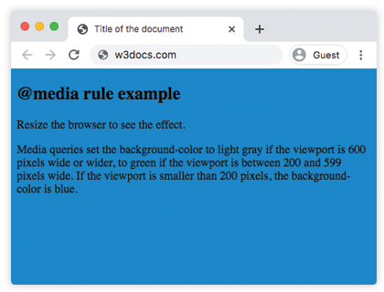
<h2>@media rule example</h2>
<p>Media queries set the background-color to grey if the viewport is 600 pixels wide or wider, to green if the viewport is between 200 and 599 pixels wide. If the viewport is smaller than 200 pixels, the background-color is blue.</p>
<h3>Change the appearance of DIV on different screen sizes</h3>
<div class="box">DIV</div>
</body>
</html>Tipos de medios
| Value | Description |
|---|---|
| all | This value is used for all devices. This is the default value of this property. |
| Is used for printers. | |
| screen | Is used for color computer screens. |
| speech | Is used for speakers. |
Ejemplo de uso de media para ocultar un elemento en dispositivos extra pequeños:
CSS @media Rule
<!DOCTYPE html>
<html>
  <head>
    <meta name="viewport" content="width=device-width, initial-scale=1, maximum-scale=1, user-scalable=no" />
    <style>
      @media (max-width: 767px) {
        .hide-mobile {
          display: none;
        }
      }
    </style>
  </head>
  <body>
    <h1>Hi</h1>
    <p>There is some text for example.</p>
    <p class="hide-mobile">This text will be hidden on large devices.</p>
    <p>There is some text for example.</p>
  </body>
</html>Ejemplo de uso de media para cambiar el color de fondo del contenido en diferentes dispositivos.
CSS @media Rule
<!DOCTYPE html>
<html>
  <head>
    <title>Title of the document</title>
    <style>
      @media screen and (max-width: 767px) {
        .content {
          background-color: lightblue;
          padding: 30px;
        }
      }
      @media screen and (min-width: 768px) {
        .content {
          background-color: pink;
          padding: 10px;
        }
      }
      @media screen and (min-width: 800px) {
        .content {
          background-color: lightgreen;
          color: white;
          padding: 50px;
        }
      }
    </style>
  </head>
  <body>
    <div class="content">
      <h2>Resize the browser to see the effect.</h2>
      <p>
        CSS is a rule-based language, which means that you define
        rules specifying groups of styles applying to particular
        elements or groups of elements on the web page.
      </p>
    </div>
  </body>
</html>Características de medios
| Value | Description |
|---|---|
| width | The width of the viewport. |
| height | The height of the viewport. |
| orientation | The orientation of the viewport. |
| aspect-ratio | The ratio of the value of the "width" media feature to the value of the "height" media feature. |
| grid | Queries whether the output device is grid or bitmap. |
| color | The number of bits per color component of the output device. If device is not a color one, the value is 0. |
| color-gamut | The approximate range of colors that are supported by the user agent and output device. |
| inverted-colors | Queries whether the browser or underlying OS invert colors or not. |
| hover | Queries whether the primary input mechanism allows the user to hover over elements or not. |
| any-hover | Queries whether the available input mechanism allows the user to hover over elements or not. |
| any-pointer | Queries whether the available input mechanism is a pointing device or not. |
| light-level | The light level of surroundings. |
| max-aspect-ratio | The maximum ratio between the width and the height of the display area. |
| max-color | The maximum number of bits per color component for the output device. |
| max-height | The maximum height of the display area. |
| max-monochrome | The maximum number of bits per color on a monochrome device. |
| max-resolution | The maximum resolution of the device. |
| max-width | The maximum width of the display area. |
| min-aspect-ratio | The minimum ratio between the width and the height of the display area. |
| min-color | The minimum number of bits per color component for the output device. |
| min-height | The minimum height of the display area. |
| min-monochrome | The minimum number of bits per color on a monochrome device. |
| min-resolution | The minimum resolution of the device. |
| min-width | The minimum width of the display area. |
| overflow-block | Queries how the output device handles content that overflows the viewport along the block axis. |
| overflow-inline | Queries whether the content that overflows the viewport along the inline axis can be scrolled or not. |
| pointer | Queries whether the primary input mechanism is a pointing device or not. |
| resolution | Describes the resolution of the output device. |
| scripting | Queries whether scripting is available or not. |
| update | Queries how quickly the output device can modify the appearance of the content. |
Práctica
What are the functions of media queries in CSS?