Propiedad CSS flex-basis
La propiedad flex-basis especifica el tamaño principal inicial de un elemento flexible. Cuando esta propiedad no se especifica, su valor inicial es auto.
La propiedad flex-basis es una de las propiedades CSS3.
Si no hay elementos flexibles, la propiedad flex-basis no tendrá ningún efecto.
Cuando flex-basis se establece en una longitud o porcentaje específico, tiene prioridad sobre width (o height si flex-direction es column) para determinar el tamaño principal inicial del elemento.
Nota: La propiedad abreviada flex establece flex-basis junto con flex-grow y flex-shrink. Si se especifica flex, tiene prioridad sobre la propiedad independiente flex-basis.
| Valor inicial | auto |
|---|---|
| Se aplica a | Elementos flexibles, incluidos pseudo-elementos en flujo. |
| Heredable | No. |
| Animable | Sí. Los elementos son animables. |
| Versión | CSS3 |
| Sintaxis DOM | object.style.flexBasis = "100px"; |
Sintaxis
Sintaxis de la propiedad CSS flex-basis
flex-basis: length | percentage | auto | initial | inherit | min-content | max-content | fit-content | content;Ejemplo básico
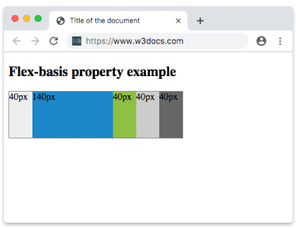
Ejemplo de la propiedad CSS flex-basis
<!DOCTYPE html>
<html>
  <head>
    <title>Title of the document</title>
    <style>
      .box {
        width: 300px;
        height: 80px;
        border: 1px solid #666;
        display: flex;
      }
      .box div {
        flex-grow: 0;
        flex-shrink: 0;
        flex-basis: 40px;
      }
      .box div:nth-of-type(2) {
        flex-basis: 140px;
      }
    </style>
  </head>
  <body>
    <h2>Flex-basis property example</h2>
    <div class="box">
      <div style="background-color: #eeeeee;">40px</div>
      <div style="background-color: #1c87c9;">140px</div>
      <div style="background-color: #8ebf42;">40px</div>
      <div style="background-color: #cccccc;">40px</div>
      <div style="background-color: #666666;">40px</div>
    </div>
  </body>
</html>Resultado
Ejemplo con todos los valores
Ejemplo de la propiedad flex-basis con todos los valores:
<!DOCTYPE html>
<html>
  <head>
    <title>Title of the document</title>
    <style>
      .box {
        height: 70px;
        display: flex;
      }
      .box div {
        flex-grow: 0;
        flex-shrink: 0;
        flex-basis: 60px;
        padding: 15px;
      }
      .box div:first-child {
        background-color: #40c3da;
      }
      .box div:nth-of-type(2) {
        flex-basis: 40%;
        background-color: lightgreen;
      }
      .box div:nth-of-type(3) {
        flex-basis: auto;
        background-color: yellow;
      }
      .box div:nth-of-type(4) {
        flex-basis: initial;
        background-color: orange;
      }
      .box div:nth-of-type(5) {
        flex-basis: inherit;
        background-color: pink;
      }
    </style>
  </head>
  <body>
    <h2>Flex-basis property example</h2>
    <div class="box">
      <div>
        number 60px
      </div>
      <div>
        percentage 40%
      </div>
      <div>
        auto
      </div>
      <div>
        initial
      </div>
      <div>
        inherit
      </div>
    </div>
  </body>
</html>Ejemplo con valores en píxeles
Ejemplo de la propiedad flex-basis especificada en píxeles:
<!DOCTYPE html>
<html>
  <head>
    <title>Title of the document</title>
    <style>
      .box {
        width: 460px;
        height: 70px;
        display: flex;
      }
      .box div {
        flex-grow: 0;
        flex-shrink: 0;
        flex-basis: 70px;
        padding: 15px;
      }
      .box div:first-child {
        background-color: #40c3da;
      }
      .box div:nth-of-type(2) {
        flex-basis: 100px;
        background-color: lightgreen;
      }
      .box div:nth-of-type(3) {
        background-color: #1c87c9;
      }
      .box div:nth-of-type(4) {
        flex-basis: 150px;
        background-color: orange;
      }
      .box div:nth-of-type(5) {
        background-color: #8ebf42;
      }
    </style>
  </head>
  <body>
    <h2>Flex-basis property example</h2>
    <div class="box">
      <div>
        70px
      </div>
      <div>
        100px
      </div>
      <div>
        70px
      </div>
      <div>
        150px
      </div>
      <div>
        70px
      </div>
    </div>
  </body>
</html>Valores
| Valor | Descripción | Probar » |
|---|---|---|
| length | percentage | Especifica un tamaño fijo usando unidades como px, em, rem o un porcentaje (%). | Probar » |
| auto | El valor predeterminado. El tamaño del elemento lo determina su contenido o las propiedades width/height. | Probar » |
| initial | Establece la propiedad en su valor predeterminado. | Probar » |
| inherit | Hereda esta propiedad de su elemento padre. | |
| min-content | Ajusta el tamaño del elemento según el ancho/alto mínimo del contenido. | Probar » |
| max-content | Ajusta el tamaño del elemento según el ancho/alto máximo del contenido. | Probar » |
| fit-content | Ajusta el tamaño del elemento según la función fit-content. | Probar » |
| content | Ajusta el tamaño del elemento según su contenido. | Probar » |
Práctica
¿Qué hace la propiedad 'flex-basis' en CSS?