Propiedad CSS grid-auto-flow
La propiedad grid-auto-flow controla cómo se distribuyen los elementos auto-colocados dentro de la cuadrícula.
Esta propiedad tiene los siguientes valores: row, column, dense, row-dense, column-dense. Si no se proporciona ni el valor "row" ni el valor "column", se asume "row".
La propiedad grid-auto-flow puede tener una sola palabra clave (dense, column o row) o dos palabras clave (column-dense o row-dense).
| Valor inicial | row |
|---|---|
| Se aplica a | Contenedores de cuadrícula. |
| Heredable | No. |
| Animable | No. |
| Versión | CSS Grid Layout Module Level 1 |
| Sintaxis DOM | object.style.gridAutoFlow = "row"; |
Sintaxis
Sintaxis de la propiedad CSS grid-auto-flow
css
grid-auto-flow: row | column | dense | row-dense | column-dense | initial | inherit;Ejemplo: grid-auto-flow: column
html
<!DOCTYPE html>
<html>
  <head>
    <title>Title of the document</title>
    <style>
      .grey-container {
        display: grid;
        grid-template-columns: auto auto auto;
        grid-template-rows: auto auto;
        grid-auto-flow: column;
        gap: 10px;
        background-color: #ccc;
        padding: 10px;
      }
      .grey-container > div {
        background-color: #eee;
        text-align: center;
        padding: 20px 0;
        font-size: 30px;
      }
    </style>
  </head>
  <body>
    <h2>Grid-auto-flow property example</h2>
    <h3>grid-auto-flow: column</h3>
    <div class="grey-container">
      <div>1</div>
      <div>2</div>
      <div>3</div>
      <div>4</div>
    </div>
  </body>
</html>Aquí, los elementos se colocan llenando cada columna. En el siguiente ejemplo, podemos ver que los elementos se colocan llenando cada fila.
Ejemplo: grid-auto-flow: row
html
<!DOCTYPE html>
<html>
  <head>
    <title>Title of the document</title>
    <style>
      .white-container {
        display: grid;
        grid-template-columns: auto auto auto;
        grid-template-rows: auto auto;
        grid-auto-flow: row;
        gap: 10px;
        background-color: #ccc;
        padding: 10px;
      }
      .white-container > div {
        background-color: #fff;
        text-align: center;
        padding: 20px 0;
        font-size: 30px;
      }
    </style>
  </head>
  <body>
    <h2>Grid-auto-flow property example</h2>
    <h3>grid-auto-flow: row</h3>
    <div class="white-container">
      <div>1</div>
      <div>2</div>
      <div>3</div>
      <div>4</div>
    </div>
  </body>
</html>Ejemplo: grid-auto-flow: row (con colocación explícita)
html
<!DOCTYPE html>
<html>
  <head>
    <title>Title of the document</title>
    <style>
      .grey-container {
        height: 250px;
        width: 250px;
        display: grid;
        gap: 20px;
        grid-template: repeat(4, 1fr) / repeat(2, 1fr);
        grid-auto-flow: row;
        background-color: #ccc;
        padding: 10px;
      }
      .box1 {
        background-color: #00f3ff;
        grid-row-start: 3;
      }
      .box2 {
        background-color: #ff00d4;
      }
      .box3 {
        background-color: #827c7c;
      }
      .box4 {
        grid-column-start: 2;
        background-color: orange;
      }
    </style>
  </head>
  <body>
    <div class="grey-container">
      <div class="box1"></div>
      <div class="box2"></div>
      <div class="box3"></div>
      <div class="box4"></div>
    </div>
  </body>
</html>Resultado
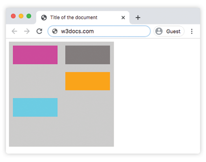
Ejemplo: grid-auto-flow: column (con colocación explícita)
html
<!DOCTYPE html>
<html>
  <head>
    <title>Title of the document</title>
    <style>
      .grey-container {
        height: 250px;
        width: 250px;
        display: grid;
        gap: 20px;
        grid-template: repeat(4, 1fr) / repeat(2, 1fr);
        grid-auto-flow: column;
        background-color: #ccc;
        padding: 10px;
      }
      .box1 {
        background-color: #00f3ff;
        grid-row-start: 3;
      }
      .box2 {
        background-color: #827c7c;
      }
      .box3 {
        background-color: #ff00d4;
      }
      .box4 {
        grid-column-start: 2;
        background-color: #4cbb13;
      }
    </style>
  </head>
  <body>
    <div class="grey-container">
      <div class="box1"></div>
      <div class="box2"></div>
      <div class="box3"></div>
      <div class="box4"></div>
    </div>
  </body>
</html>Ejemplo: grid-auto-flow: column-dense
html
<!DOCTYPE html>
<html>
  <head>
    <title>Title of the document</title>
    <style>
      .grey-container {
        height: 250px;
        width: 250px;
        display: grid;
        gap: 20px;
        grid-template: repeat(4, 1fr) / repeat(2, 1fr);
        grid-auto-flow: column-dense;
        background-color: #ccc;
        padding: 10px;
      }
      .box1 {
        background-color: #0ad6e0;
        grid-row-start: 3;
      }
      .box2 {
        background-color: #841c72;
      }
      .box3 {
        background-color: #827c7c;
      }
      .box4 {
        grid-column-start: 2;
        background-color: #4cbb13;
      }
    </style>
  </head>
  <body>
    <div class="grey-container">
      <div class="box1"></div>
      <div class="box2"></div>
      <div class="box3"></div>
      <div class="box4"></div>
    </div>
  </body>
</html>Ejemplo: grid-auto-flow: row-dense
html
<!DOCTYPE html>
<html>
  <head>
    <title>Title of the document</title>
    <style>
      .grey-container {
        height: 250px;
        width: 250px;
        display: grid;
        gap: 20px;
        grid-template: repeat(4, 1fr) / repeat(2, 1fr);
        grid-auto-flow: row-dense;
        background-color: #ccc;
        padding: 10px;
      }
      .box1 {
        background-color: #0ad6e0;
        grid-row-start: 3;
      }
      .box2 {
        background-color: #841c72;
      }
      .box3 {
        background-color: #827c7c;
      }
      .box4 {
        grid-column-start: 2;
        background-color: #4cbb13;
      }
    </style>
  </head>
  <body>
    <div class="grey-container">
      <div class="box1"></div>
      <div class="box2"></div>
      <div class="box3"></div>
      <div class="box4"></div>
    </div>
  </body>
</html>Valores
| Valor | Descripción | Probarlo |
|---|---|---|
| row | Coloca los elementos llenando cada fila, añadiendo nuevas filas si es necesario. Este es el valor predeterminado de esta propiedad. | Probarlo » |
| column | Coloca los elementos llenando cada columna, añadiendo nuevas columnas si es necesario. | Probarlo » |
| dense | Coloca los elementos para llenar cualquier hueco en la cuadrícula, independientemente del tamaño del elemento. Esto puede hacer que los elementos auto-colocados aparezcan fuera de orden en el DOM. | Probarlo » |
| row-dense | Coloca los elementos llenando cada fila y llena los huecos en la cuadrícula. | Probarlo » |
| column-dense | Coloca los elementos llenando cada columna y llena los huecos en la cuadrícula. | Probarlo » |
| initial | Hace que la propiedad use su valor predeterminado. | |
| inherit | Hereda la propiedad de su elemento padre. |
Práctica
¿Qué hace la propiedad CSS grid-auto-flow?